I’ve been getting my hair expertly cut by Deon The Barber for several years at the seminal Astor Hair barbershop in downtown NYC. A hard-working man of many interests, Deon always seems to have a different business venture going on every time I see him - life-size sculptures made out of aluminum foil, a line of razor blades and shears, and an all-inclusive social media platform, to name a few. One of Deon’s longest running projects has been Book Me Barber, an app where you can find barbers in your area, book appointments, and pay for barber services all in one place.
During my last haircut, I asked Deon how things were going with Book Me Barber. He said, “you know, things are slow.” He’s only had the help of a single developer, and simply hasn’t had the time to scale up the app’s roster of barbers and the clients that come with them. I told him about being a UX Designer and, long story short, he agreed to let me take a look at the app and come up with a few ideas for improvement.
Taking Artiom Dashinsky’s Solving Product Design Exercises book as my starting point, I first set out to understand the WHY - in other words, what was the disconnect between BMB’s stated vision and its current delivery of value? And, most importantly, why is it important to improve the app’s experiences?
Book Me Barber's mission:
Why is this redesign important?
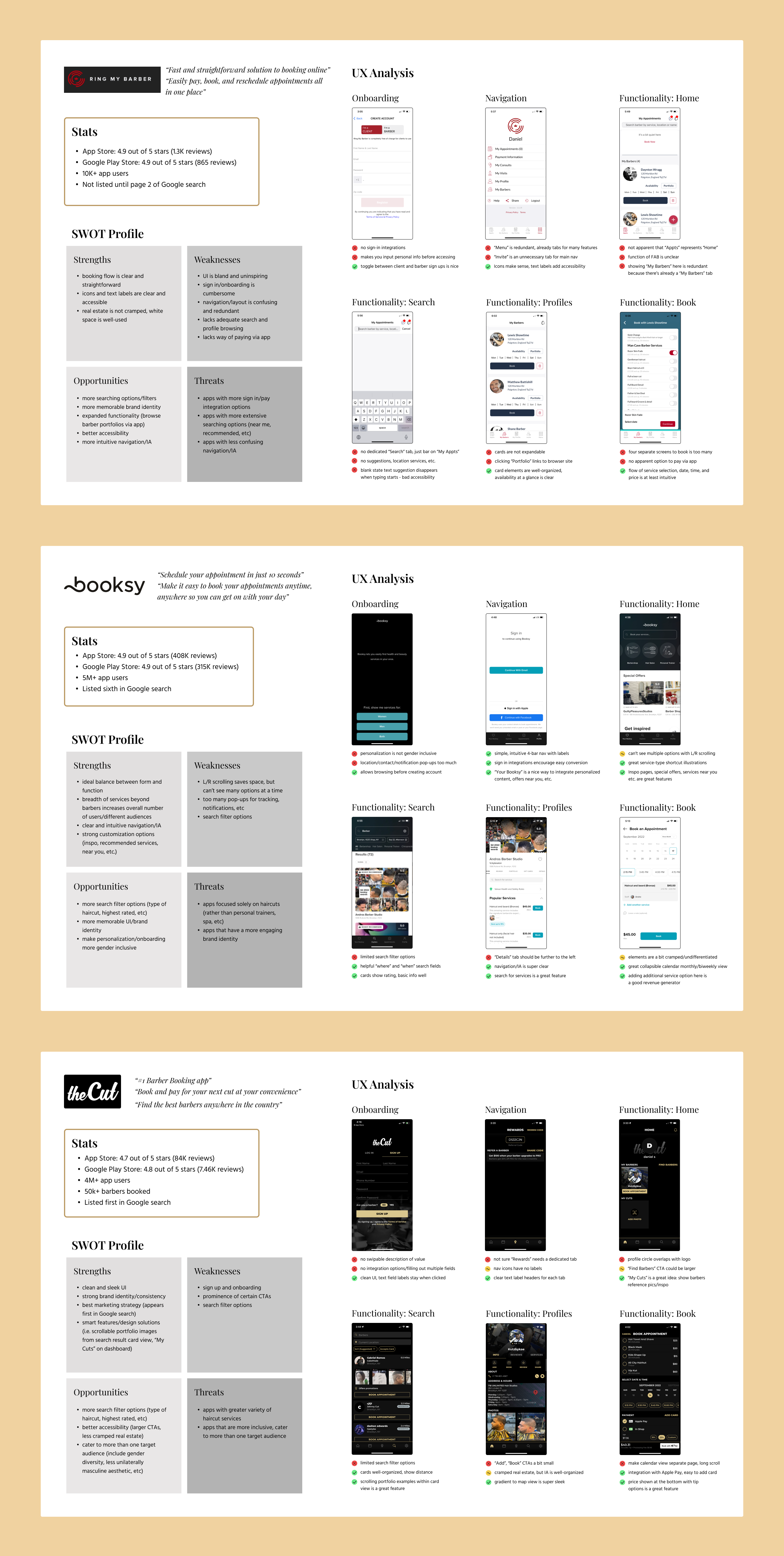
As part of this discovery phase, I selected three barber scheduling apps currently in the market representing a breadth of approaches and number of users, and conducted a competitive analysis, noting strengths, weaknesses, and opportunities compared to Book Me Barber’s current iteration. I decided to focus specifically on the client side for this first phase of study.
Having laid the groundwork for possible ways Book Me Barber could be reworked to not only match, but surpass existing competitors in the barber scheduling app market, I needed to gain better clarity on WHO BMB’s client-side audiences were, and whether BMB’s current iteration was adequately meeting their needs.
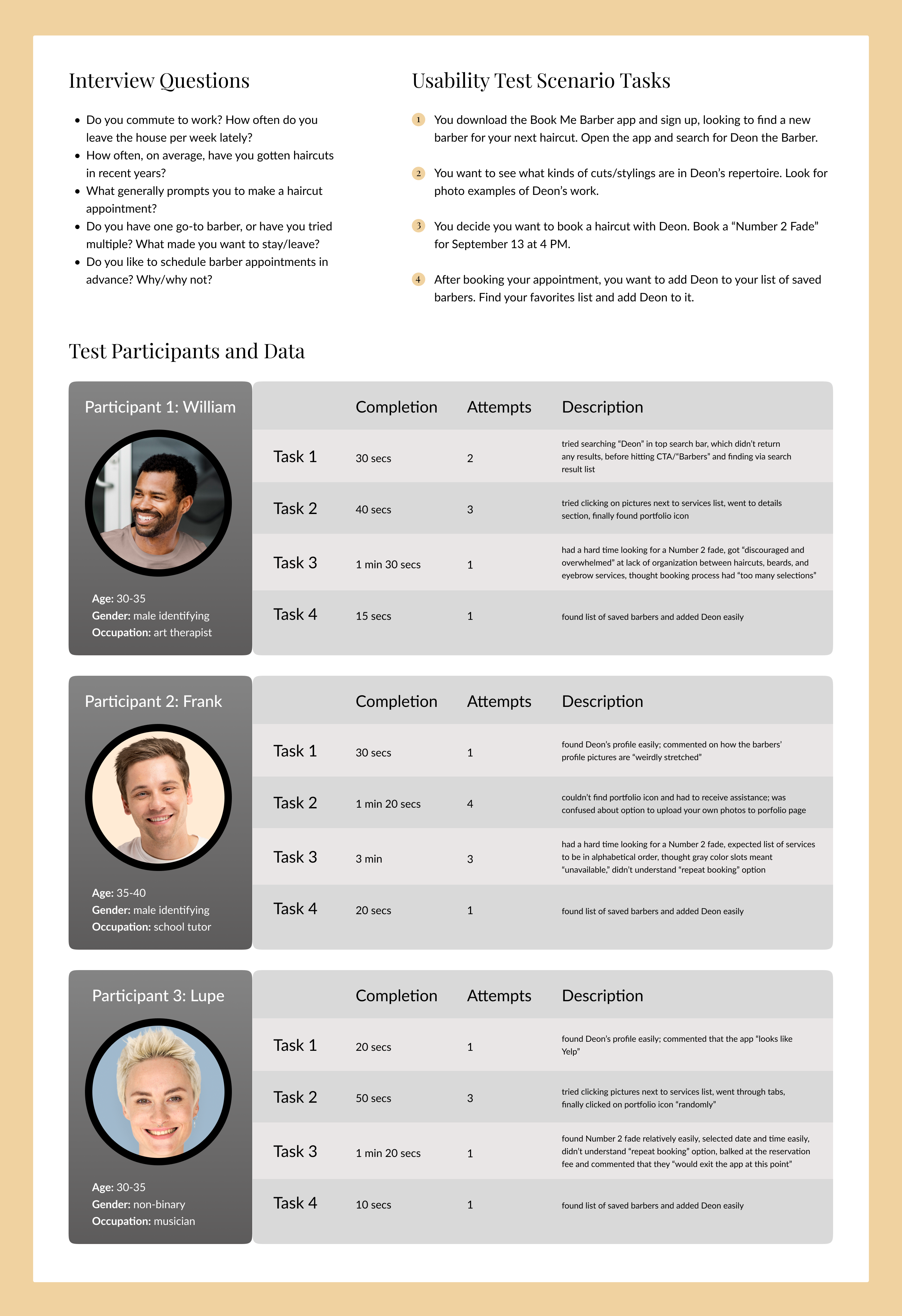
In order to understand more clearly the motivations and pain points of BMB’s target users, I recruited three participants to do some initial interviews and usability testing with the current BMB app. I created five interview questions with the aim of learning about each participant’s context and what trigger event(s) led them to seek/book a haircut - aka the WHEN and WHERE. I then led each participant through a moderated in-person usability test consisting of four short scenario tasks on the current BMB app, measuring task completion times, success rates, and oral feedback.
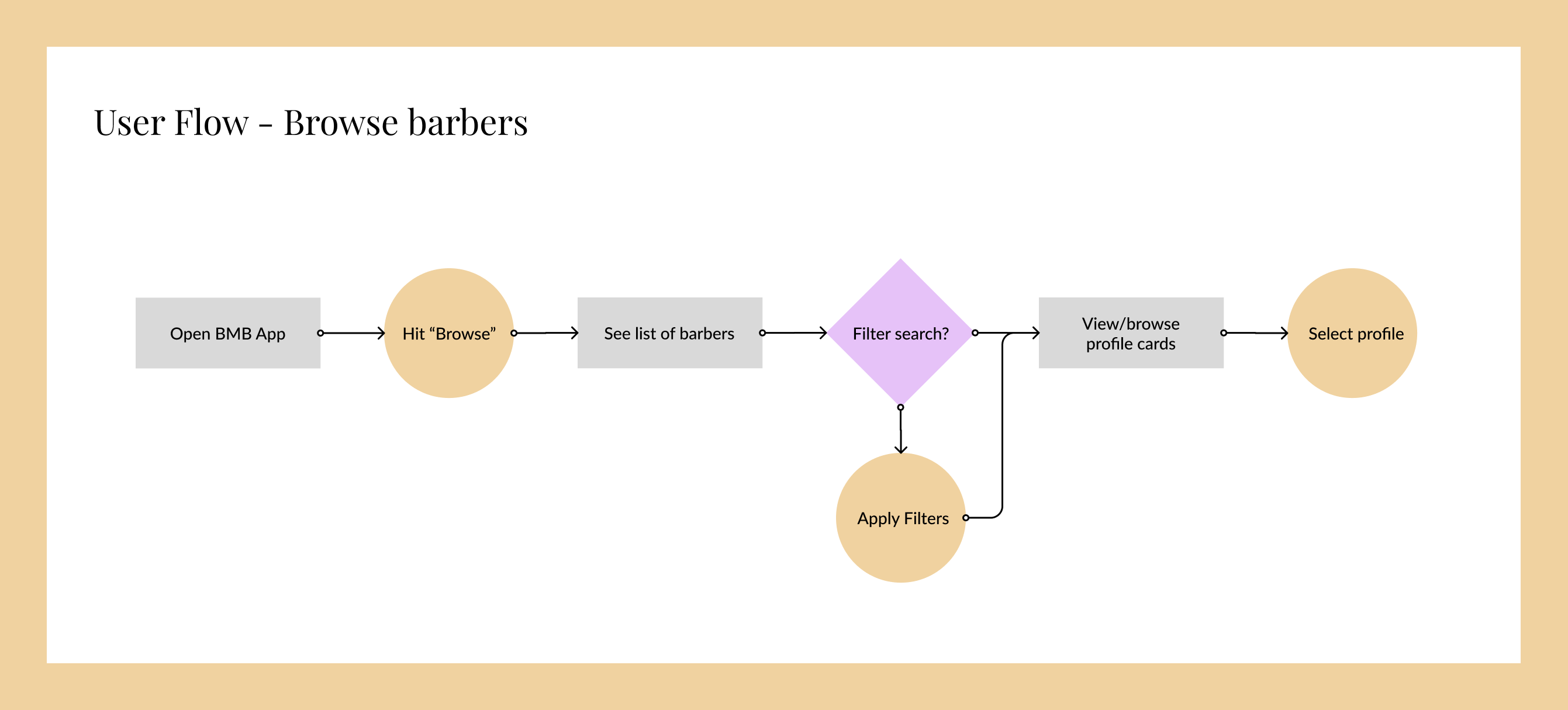
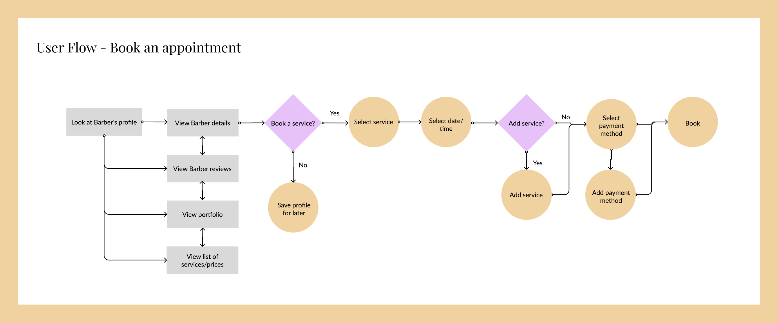
My final step before taking a stab at redesigning Book Me Barber's mobile screens was to create two user flows encapsulating the app's core functionality: browsing barbers and booking an appointment with a selected barber. These flows allowed me to visualize the most efficient path towards users' goals and consider what possible actions users might want to make at each juncture.
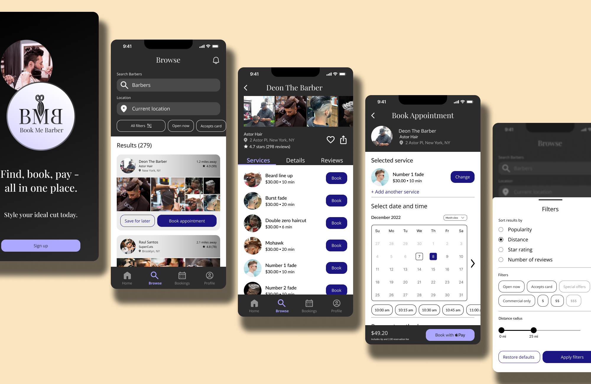
Finally, I was ready to tackle the WHAT - the proposed reimagining of the Book Me Barber client-side mobile app. I designed wireframes corresponding to the above user flows, taking into consideration both the competitive analysis and user testing I'd already completed. In particular, I drew from previous research in order to imagine what information users would want to see when filtering search results, browsing barber profiles, choosing which barber to book an appointment with, and completing their booking seamlessly. Check out the graphic below to view my design decisions in more detail:
.png)
This case study is still ongoing. Please check back for updates!


